Special Olympics Rebrand
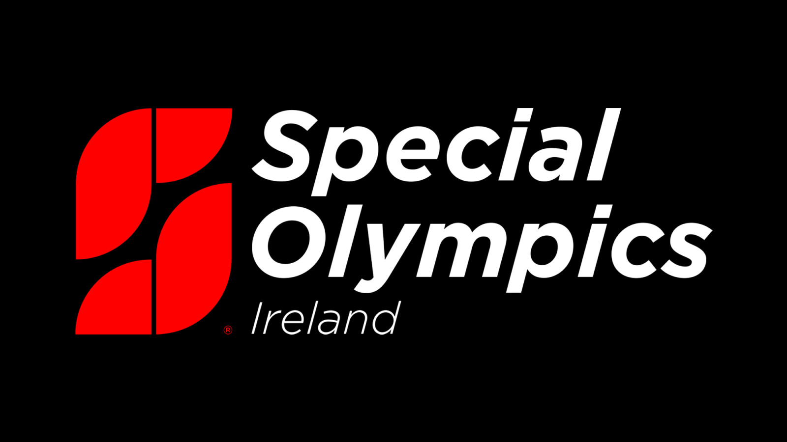
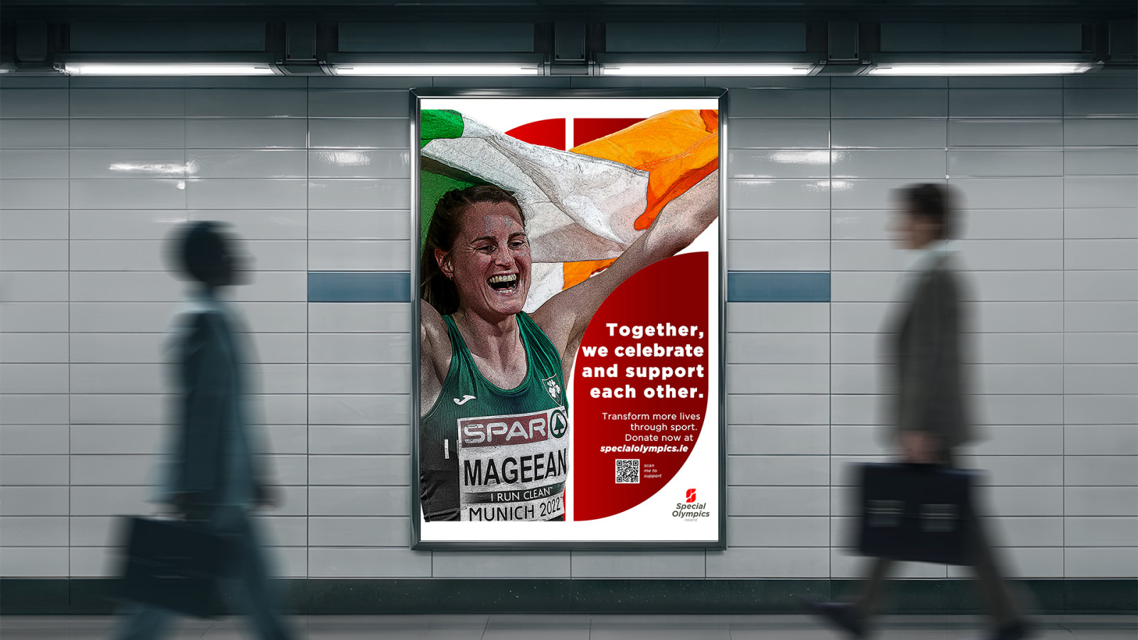
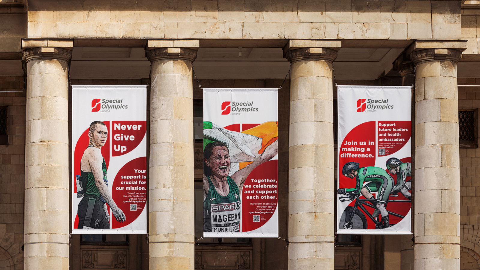
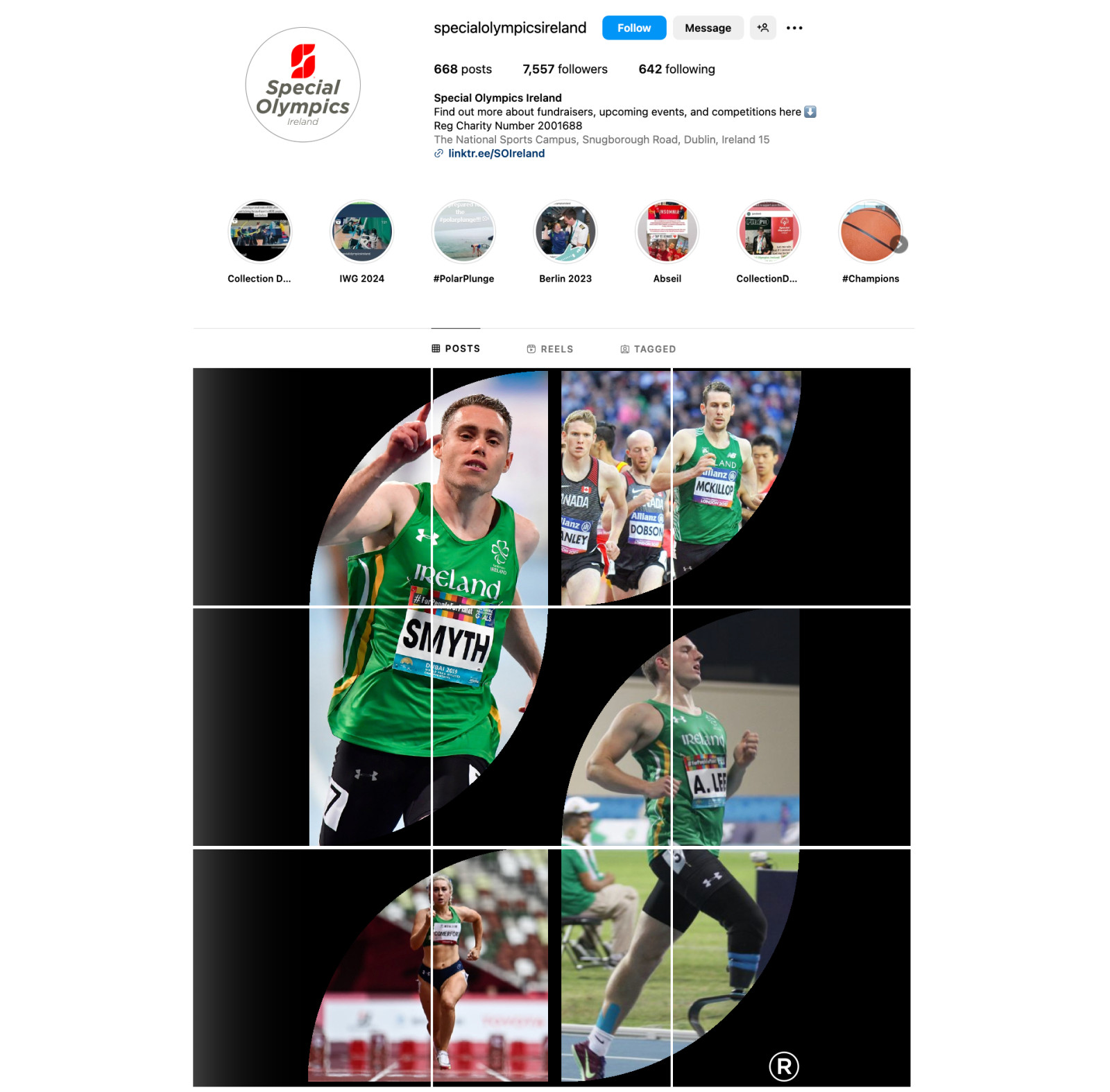
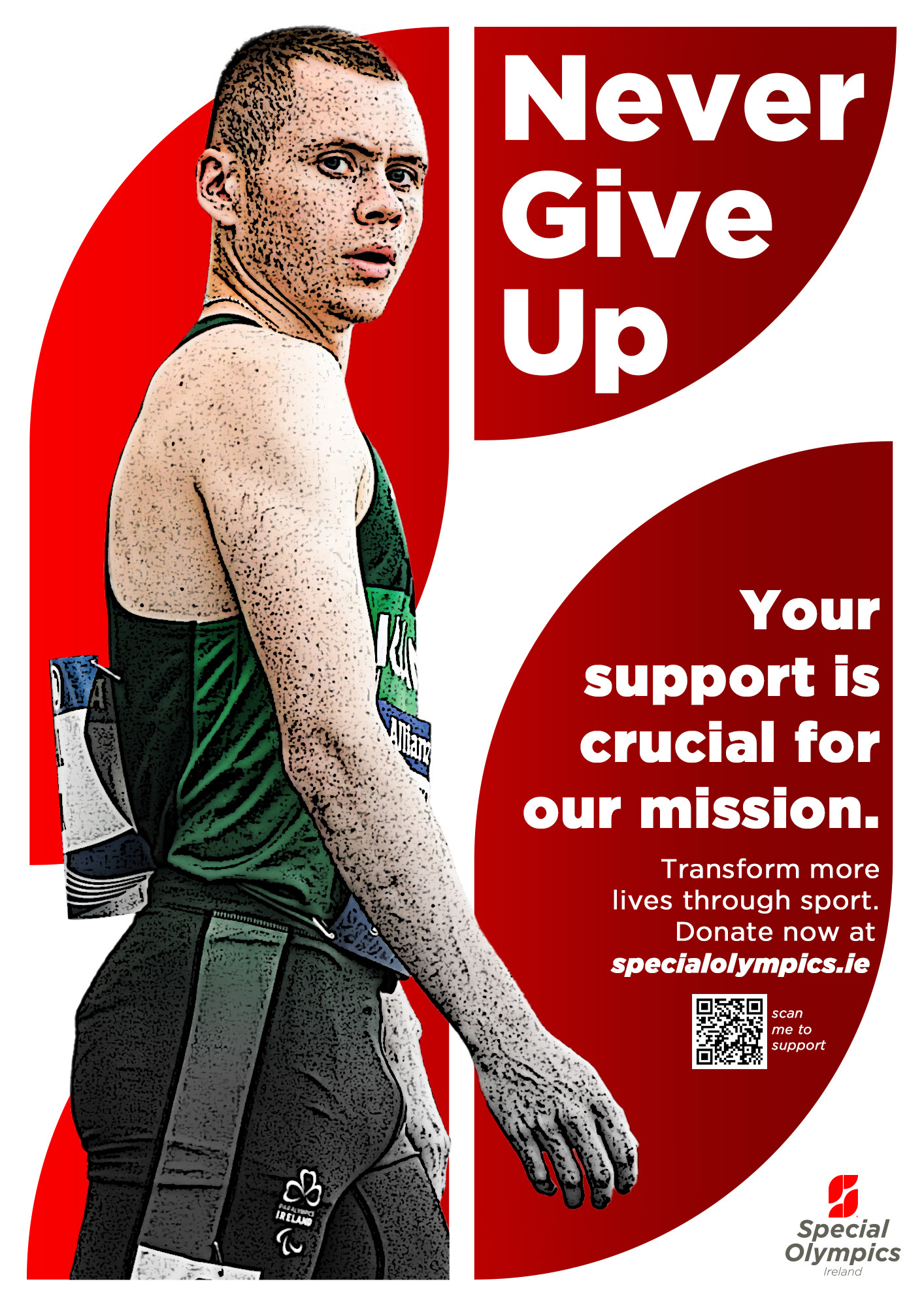
This rebrand project reimagines the Special Olympics visual identity, focusing on the strength, unity, and empowerment of athletes with disabilities. Inspired by the need for a logo that could resonate globally, the design process explored various concepts, from the shamrock, symbolising Ireland and three types of disabilities, to abstract representations of athletic arenas. Through multiple iterations, the final concept emerged: a clean, modern sans-serif typography paired with a bold symbol. Early versions incorporated complex elements that eventually gave way to a more refined, impactful design. Influenced by feedback and collaboration, the final stylised "S" symbolises movement, connection, and resilience. The rebrand honours the organisation’s inclusive spirit while delivering a contemporary, dynamic identity ready for an international audience. Every detail of the project reflects the balance between tradition and modernity, strength and accessibility, capturing the enduring energy and courage of Special Olympics athletes around the world.
Graphic Communication Design
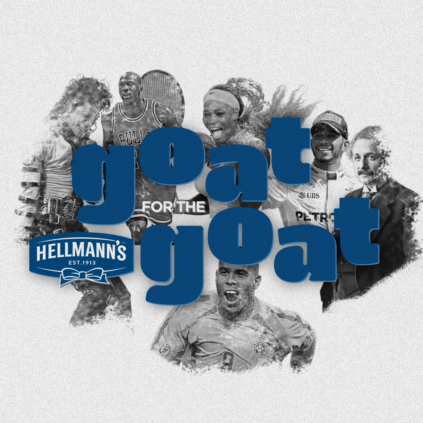
Hellman's GOAT for the GOAT!
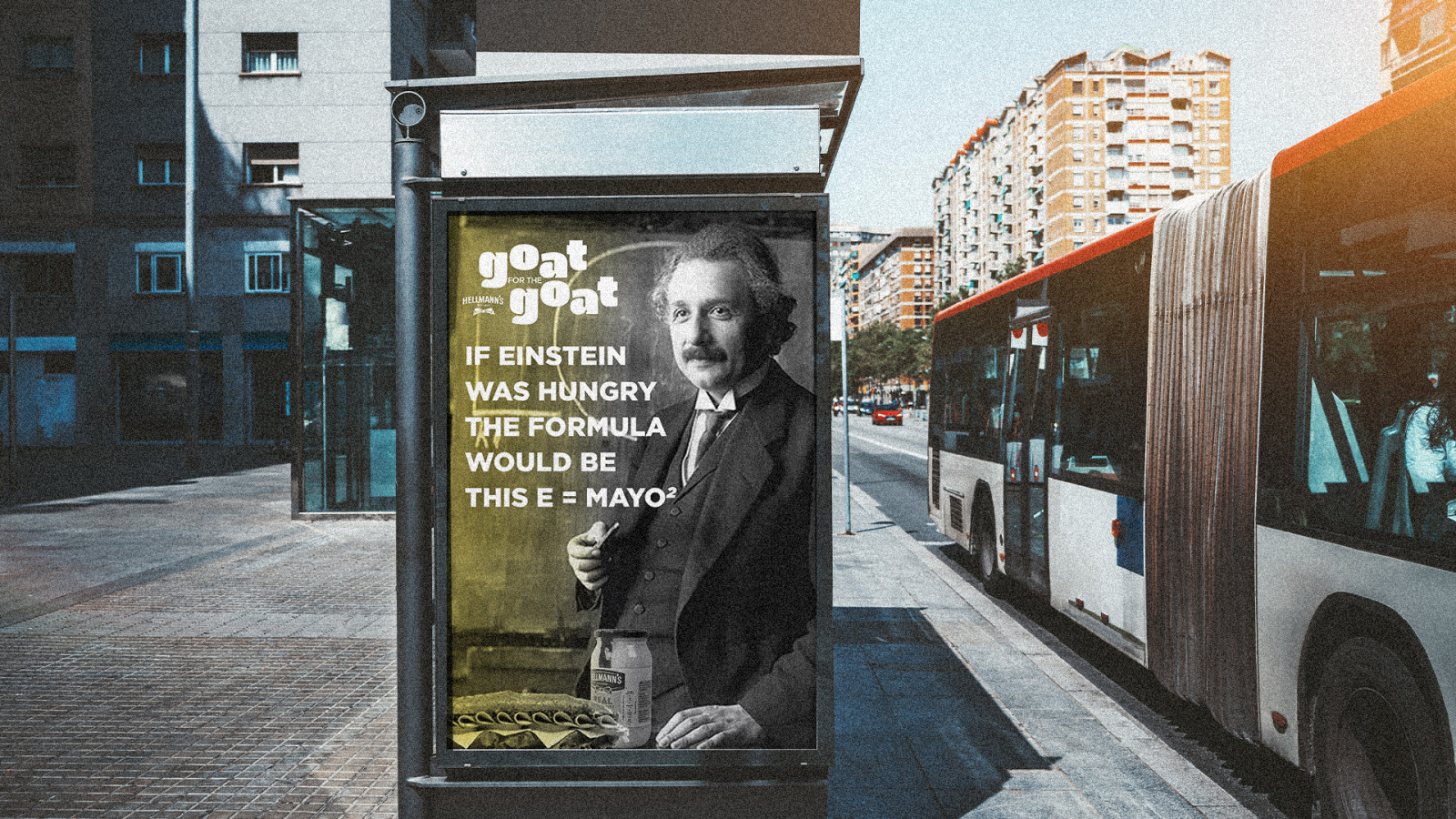
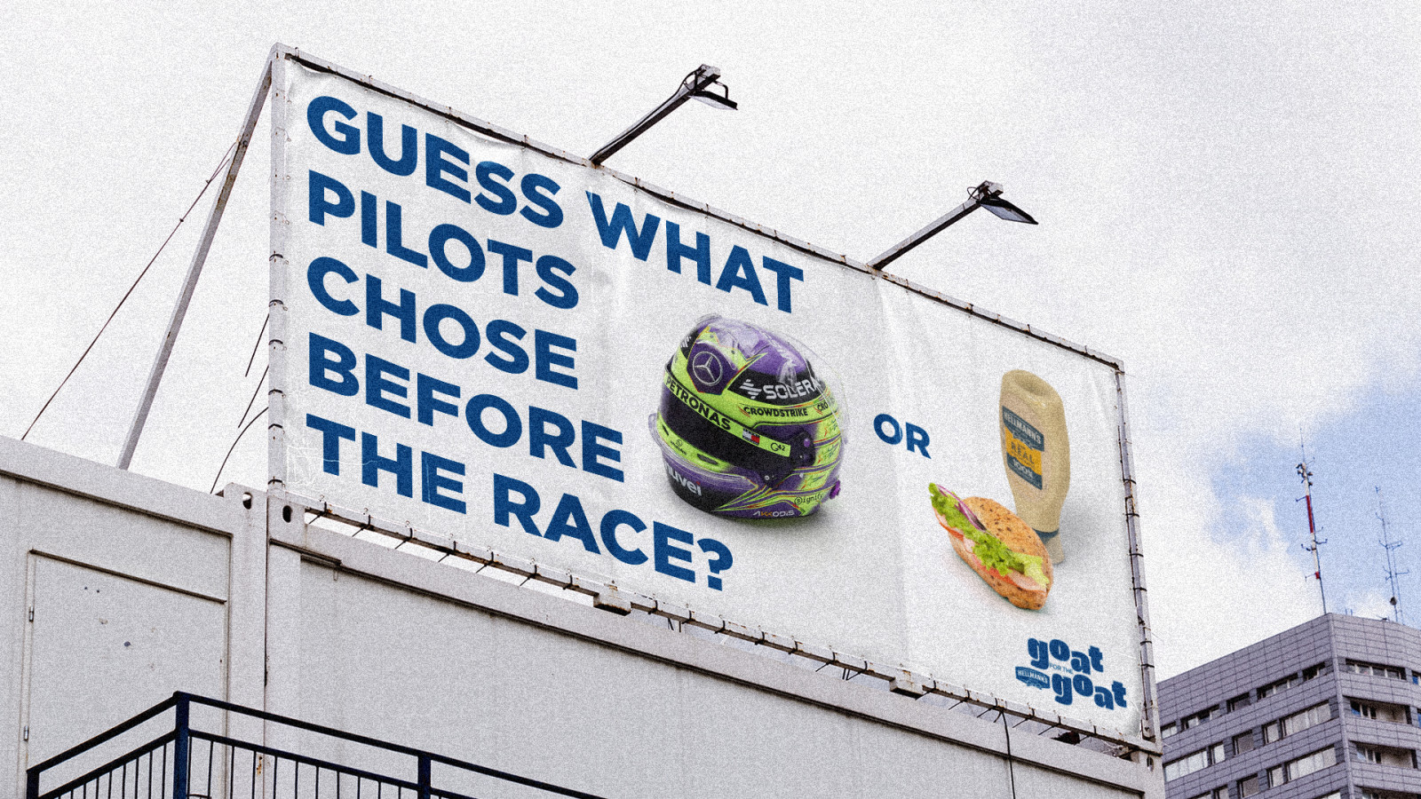
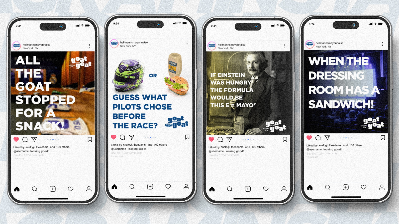
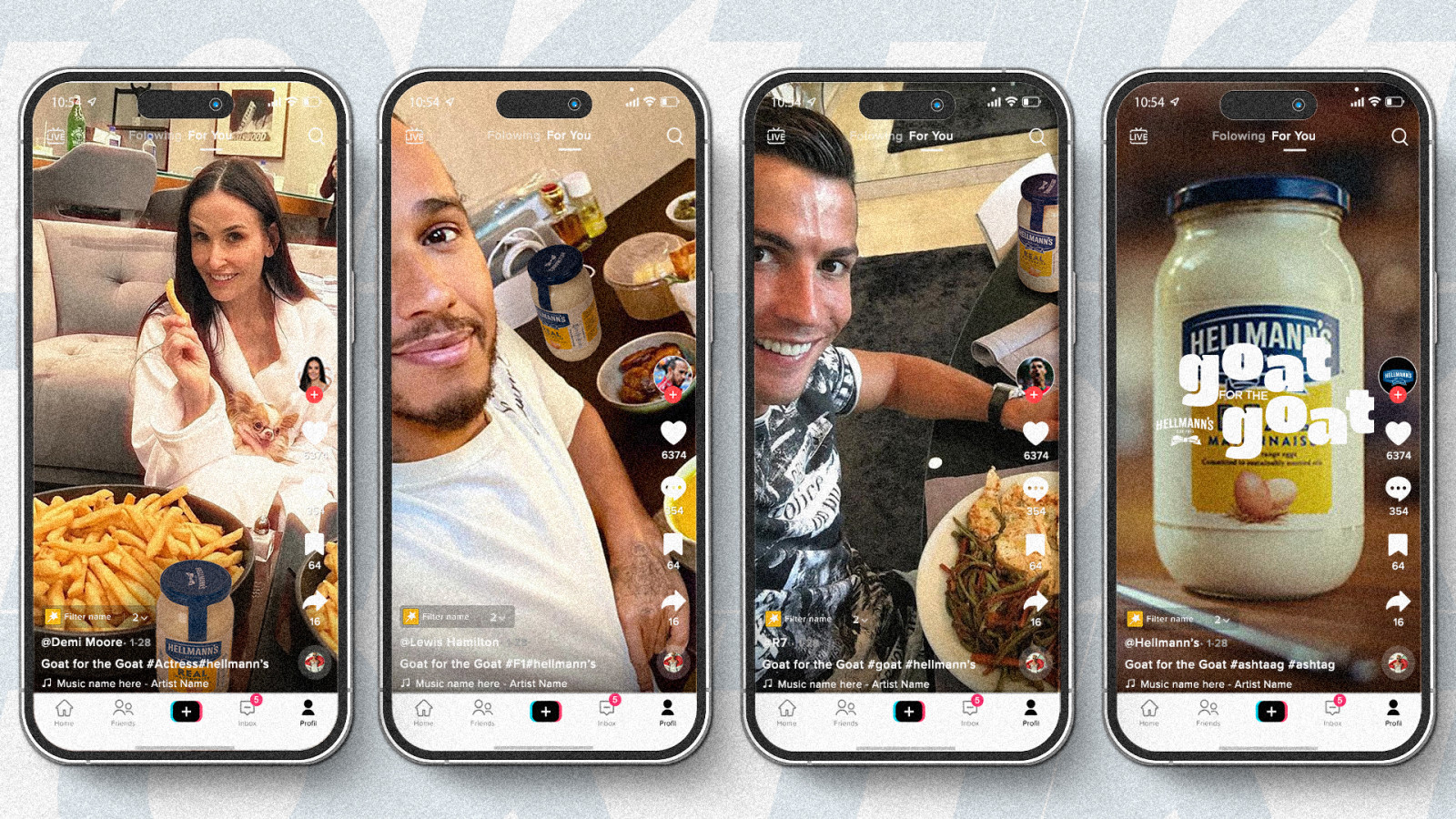
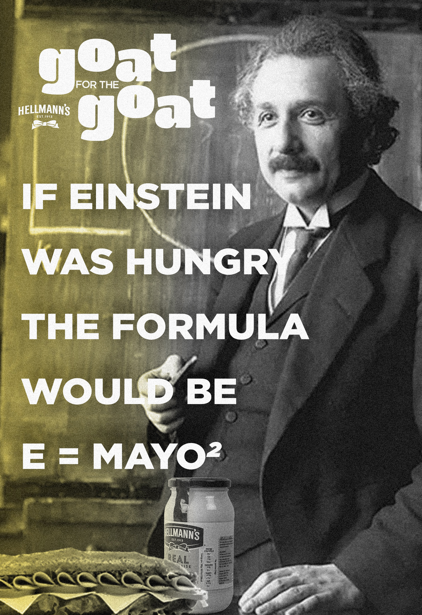
My campaign "GOAT for the GOAT!" is based on the idea that even the greatest of all time (GOATs) have to make choices in their daily lives. And sometimes, nothing is more important than enjoying a sandwich with Hellmann’s, not even a helmet before a race, a ball in a decisive moment, or an audience waiting for a performance to begin. This unexpected contrast between the extraordinary and the simple adds humour and exaggeration, making Hellmann’s not only irresistible but the true choice of the GOATs.
The campaign positions Hellmann’s as the ultimate choice for legendary athletes, musicians, and professionals, showing them putting aside even their most essential tools to savour a sandwich. Through humour and surprising scenarios, the campaign refreshes the brand’s connection with Millennials and Gen Z, making Hellmann’s feel fresh, relevant, and unmissable. It lives across digital platforms such as TikTok and Instagram, as well as in offline media, embracing a lively, dynamic, and playful tone.
More Graphic Communication Design

Sophie Schachten

Evelina Strumylaite

Charee Monroy

Elizaveta Tolmacheva

Muirin Gavigan

Nour Hajjar

Aline Larkin

Dana Mohseni

Erika Sayuri Fukasawa

Gosia Sitek

Irem Demiryurek

Jeanne Lehurt

Katarzyna Kawecka

Lea Anna Teutenberg

Leonie Maren Hirn

Lilli Laura Denk

Maria Clara Macedo

Mark Blum

Michaela McDonagh

Michal Guzy

Rob Roche

Sarah Gardner

Tawnie Ocampo


