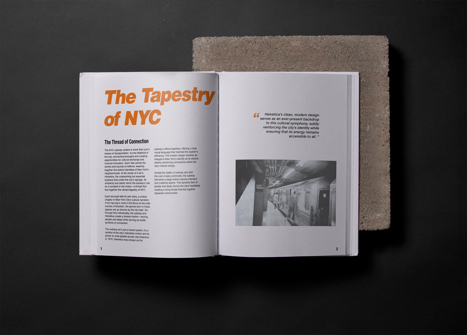
Between The Lines is a typographic exploration of New York City’s musical and cultural evolution, told through the lens of its underground transit system. Created in response to the ISTD Milestones brief, the project considers the subway not just as a means of transportation, but as a vital thread that connects boroughs, communities, and the birthplaces of influential music movements.
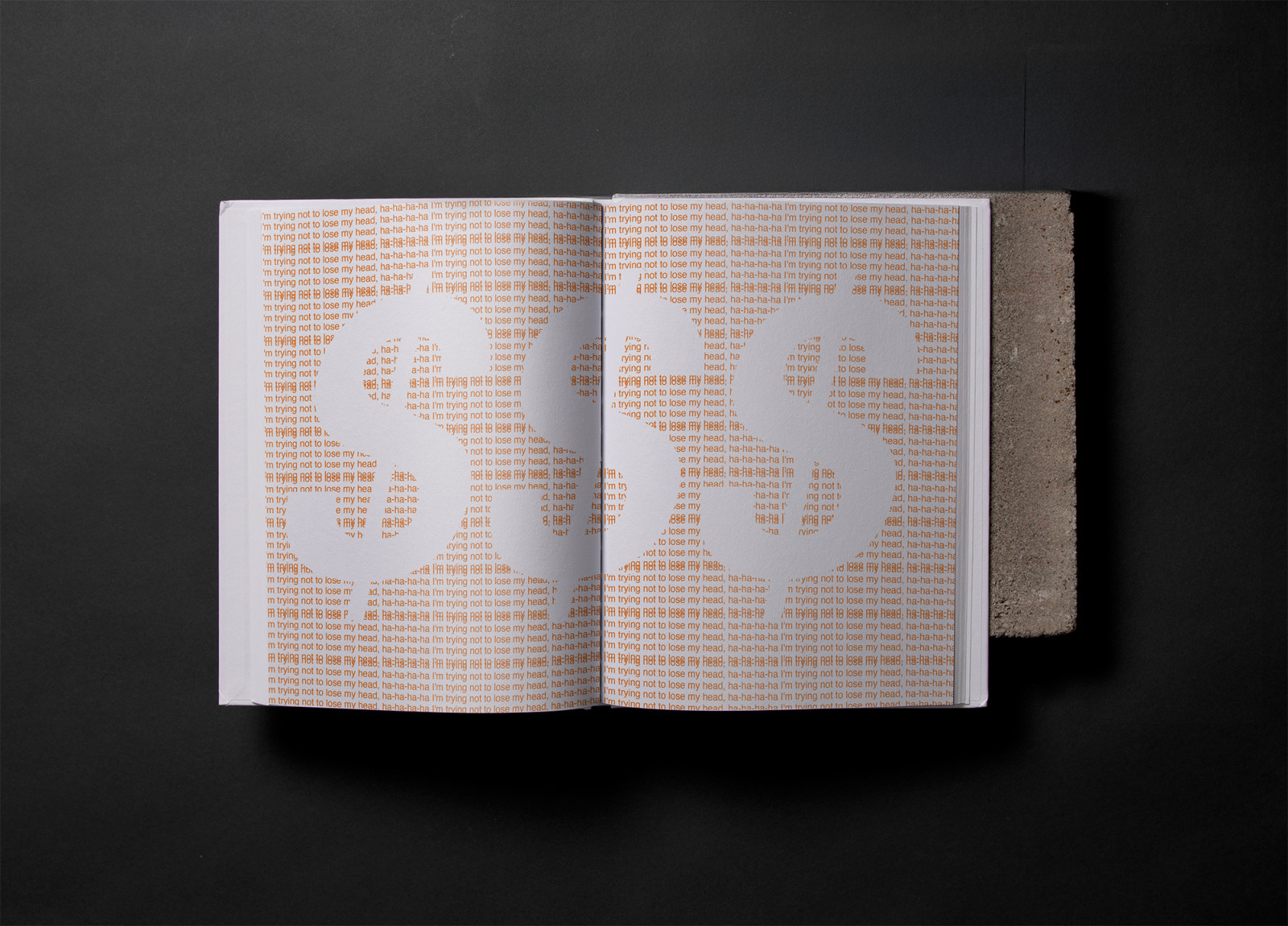
Helvetica, the typeface officially adopted by the MTA in 1970, serves as both a visual and conceptual anchor throughout. It reinforces the system’s role in unifying the city, while expressive typographic treatments, halftone textures, and scale shifts reflect the raw energy of the scenes that shaped New York’s identity.
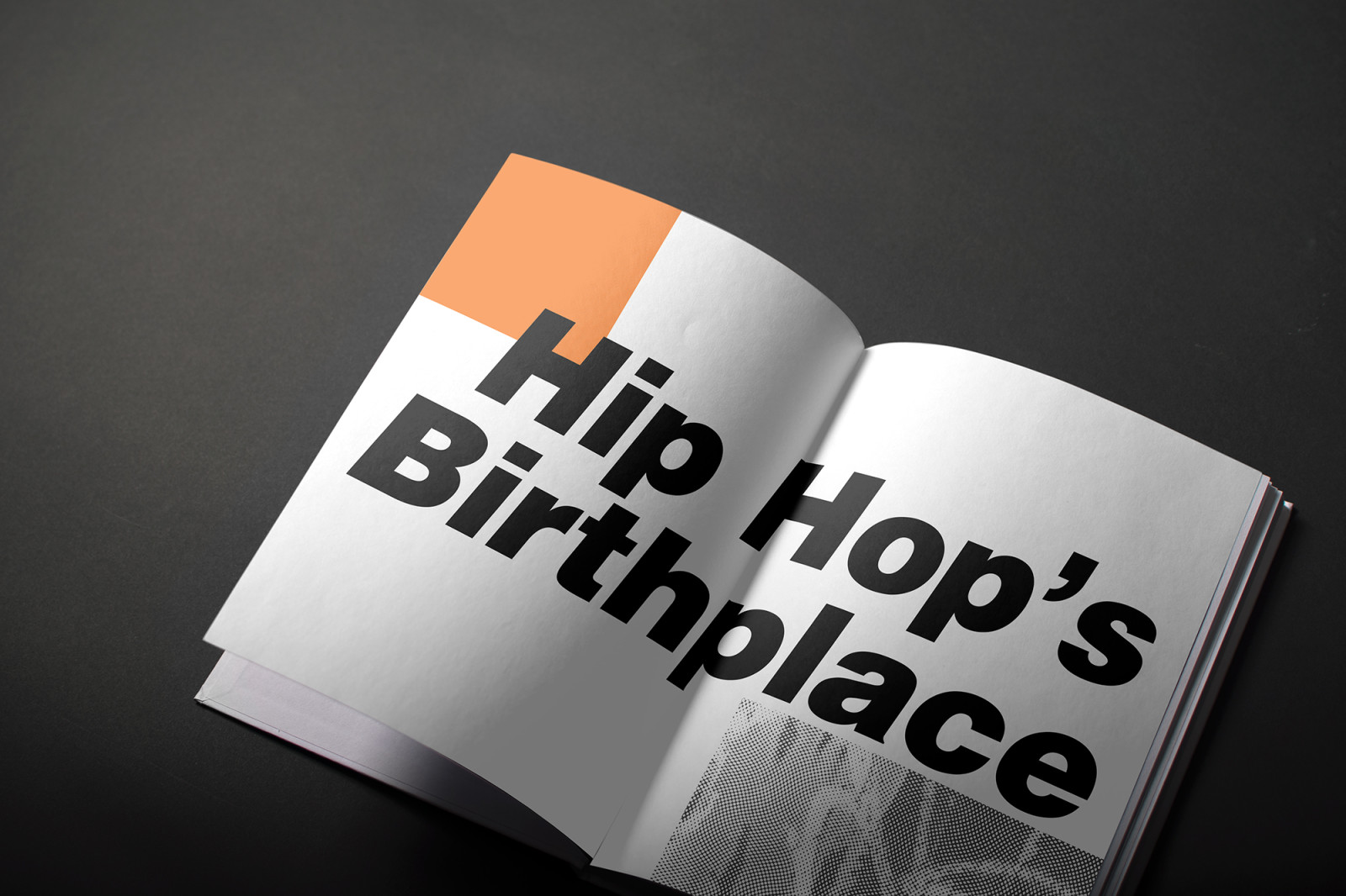
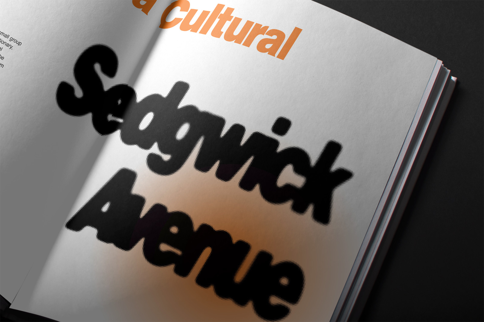
From the emergence of hip-hop on Sedgwick Avenue in the Bronx to the punk and new wave rebellion of downtown Manhattan, the book traces how music has transformed public space, culture, and design. A balance of bold, rhythmic spreads and editorial clarity mirrors the city’s pace — celebrating how type, like sound, can carry stories across generations