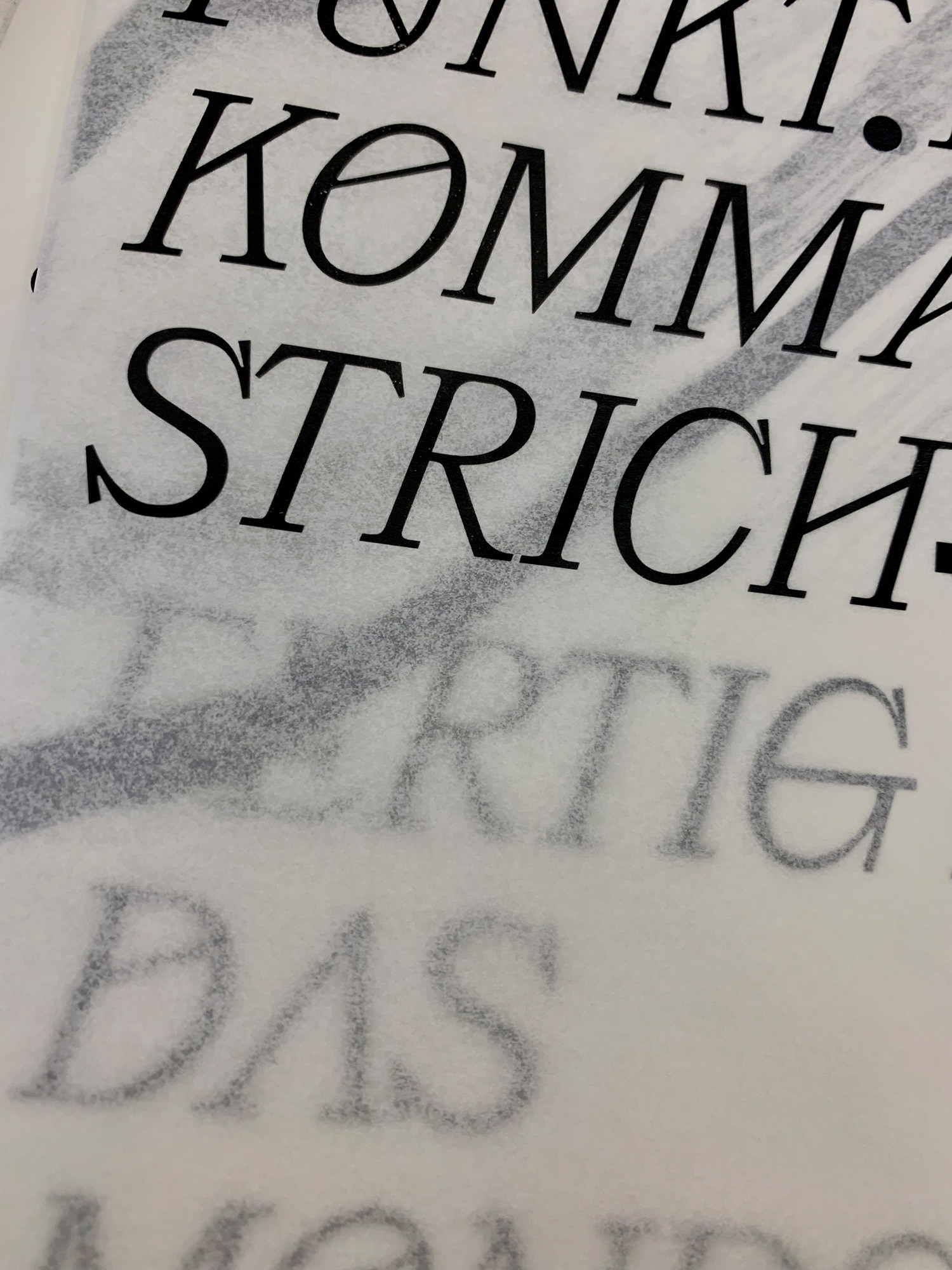
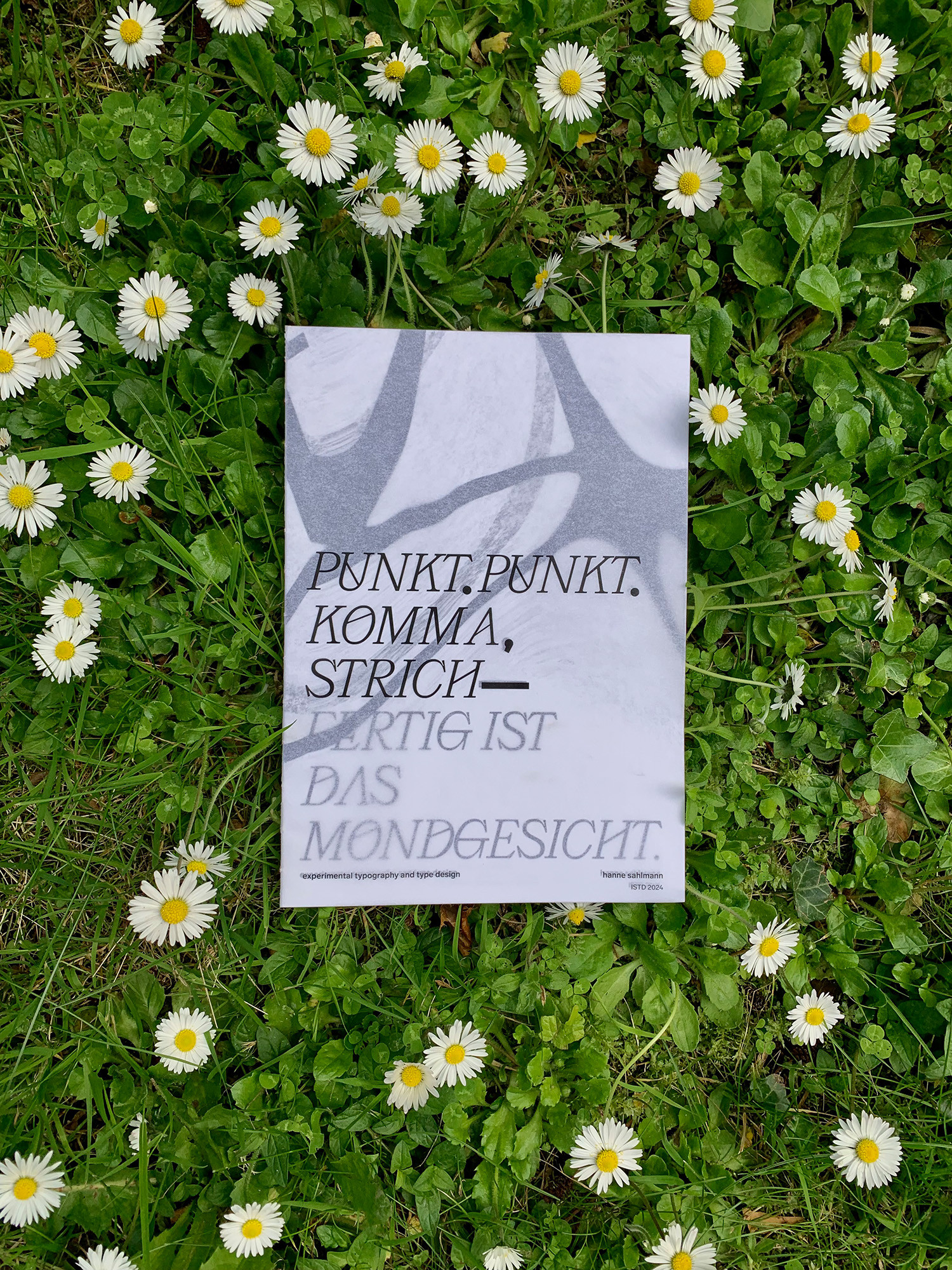
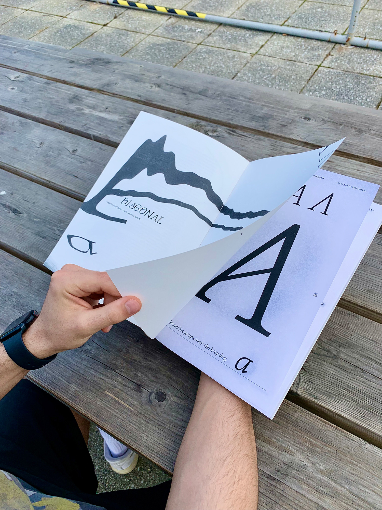
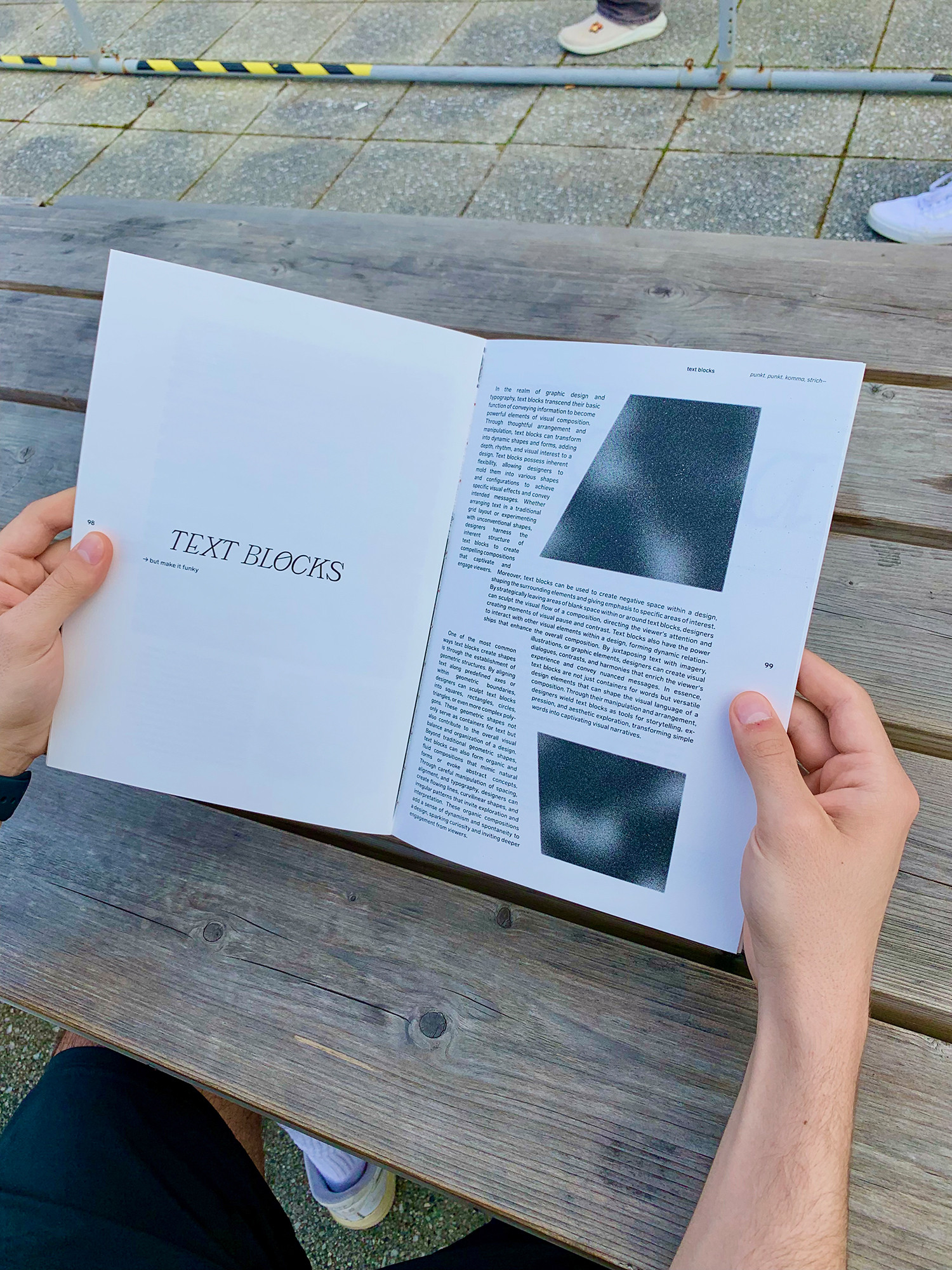
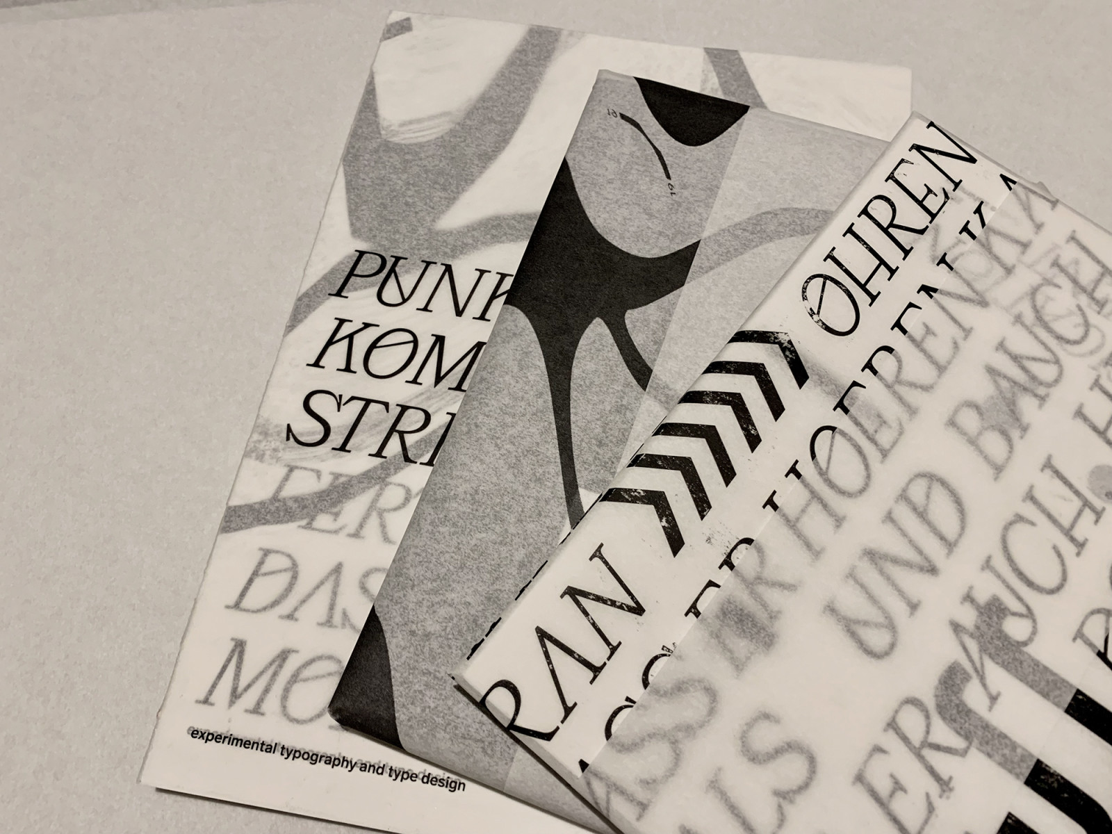
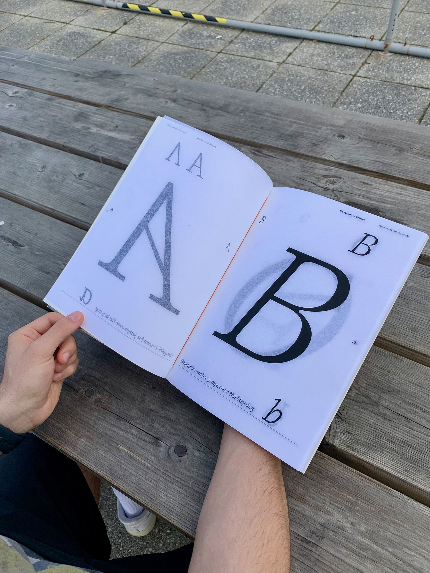
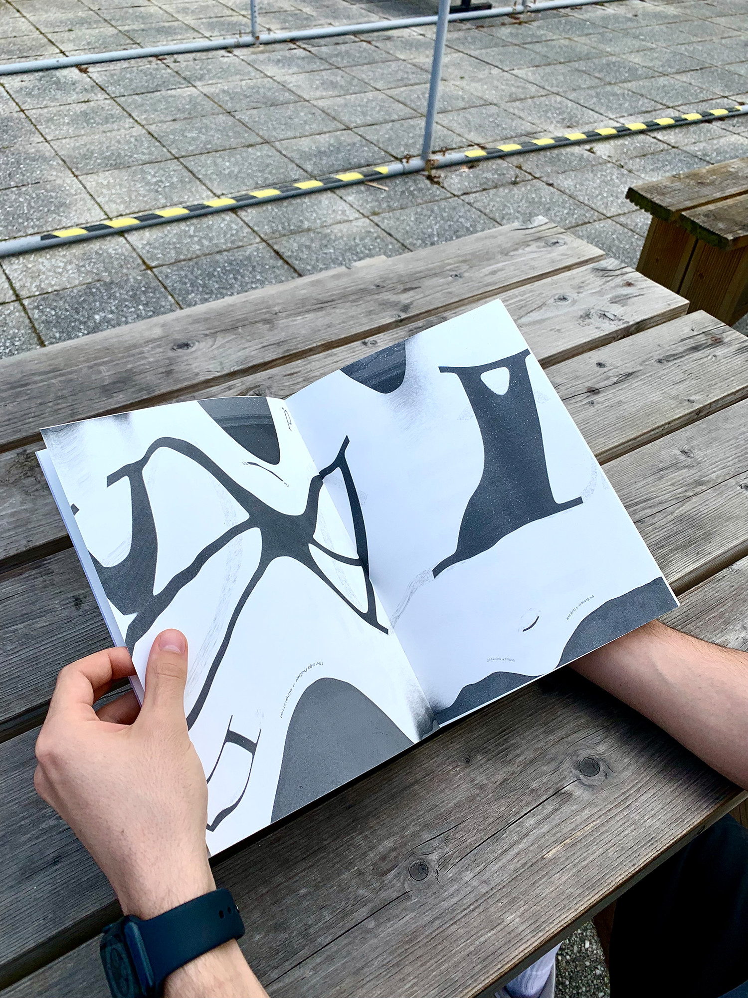
“All we need is to follow a line.” – A sentence which is correct but wrong at the same time. This sentence has been a red thread throughout the whole process of this design. Sometimes breaking rules, or in a broader sense stepping away from the line to take a different path is what gives your work a tone of voice. “Punkt. Punkt. Komma, Strich–” is a book about experimental typography and type design. I have designed a typeface which follows the same line of thoughts as the whole book. Lines that follow a pattern and rules of a serif typeface but that uses lines to break up some of those restrictions. As the typeface is merely a display font it has an additional glyph set. The idea behind this typeface is to find a way of using diagonal lines that walk a different path which makes it more dynamic and interesting for a typographic use.


