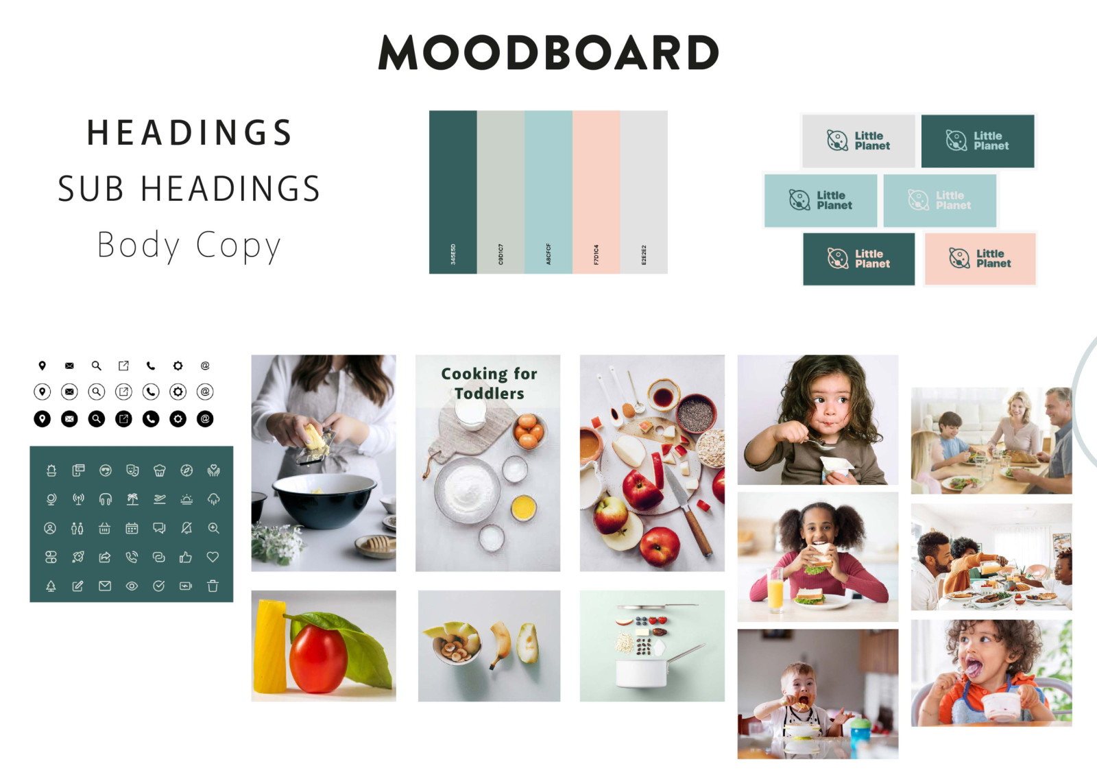
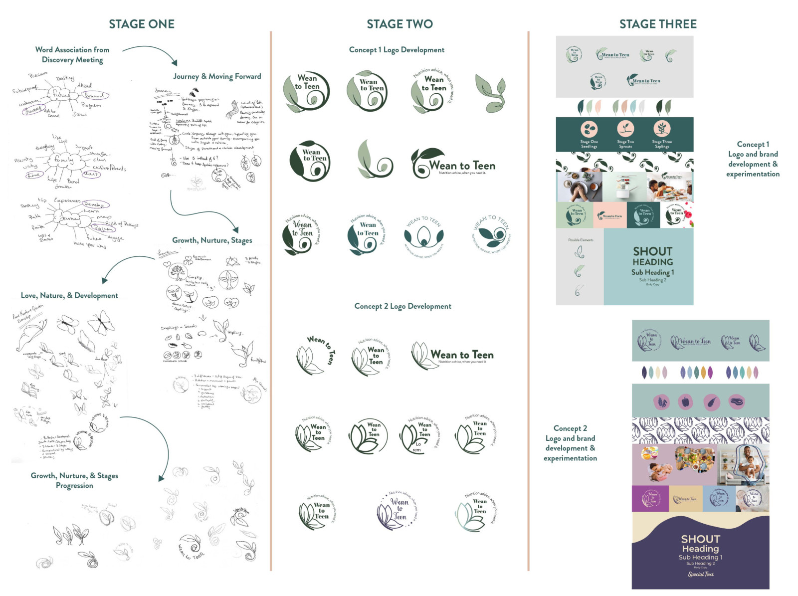
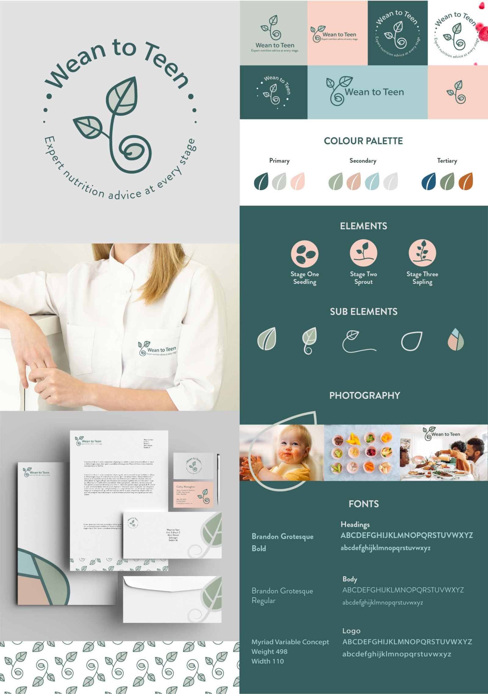
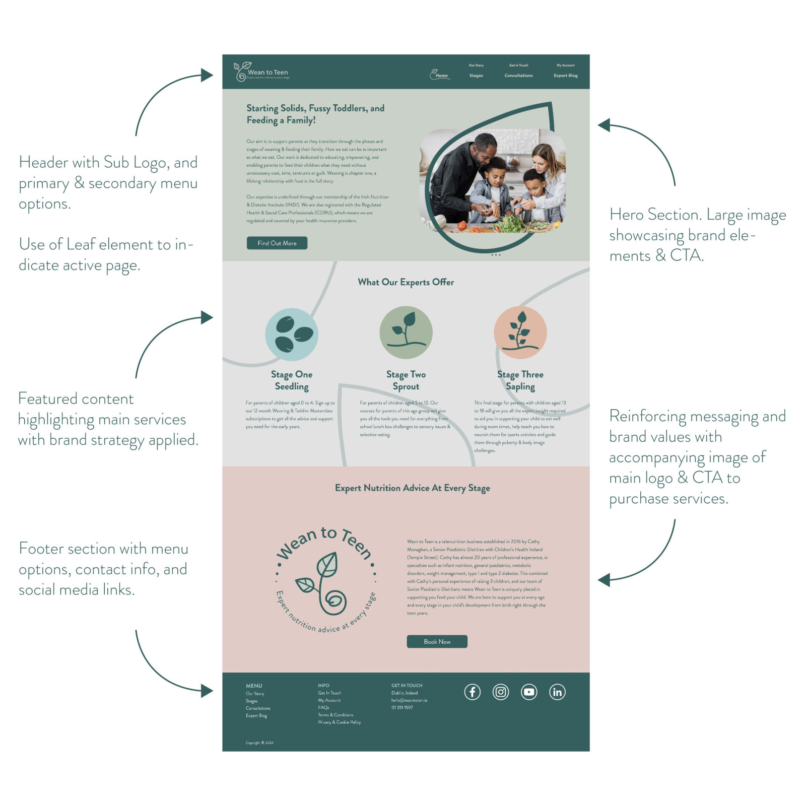
For this project I worked with Cathy Monaghan, owner of Weaning.ie. The company is a telenutrition business, so all services and communication are based online. Cathy wanted to fully rebrand & rename her company to reflect their evolving offerings and services. The project also included a brand strategy and set of branding guidelines. The discovery meeting identified the need to convey trust, passion, expertise, honesty, family & empowerment. The services offered were being broken into three developmental stages of children, which Cathy wanted to convey strongly in the brand. I based the logo on the concept of a plant growing through three definitive stages. Evocative of a child’s development and growth, the elements also double as visuals in the brands toolkit for these stages. Lines used are soft and clean, conveying approachability. The styling is contemporary to appeal to the target market, and the colour palette has been evolved from bold colours to a contemporary softer palette which prompt clarity and open communication. The new brand feels like an evolution of the old brand, building on the old palette and brand elements and incorporates the key factors from the business’s current development plan.
Graphic Communication Design

Testimony from Cathy Monaghan owner of Weaning.ie, on the rebrand project:
“Nicola was a true professional from the outset. She really respected my time. Prior to our first meeting she had fully researched my brand and had a list of relevant questions prepared. From what felt like an informal chat she implemented all that we discussed and really 'got it' from my point of view. I was really impressed by how much her designs, from the colours to the fonts to the images reflected the ideas I had in my head.
I feel privileged to have been given the opportunity to work with Nicola on this project.”


