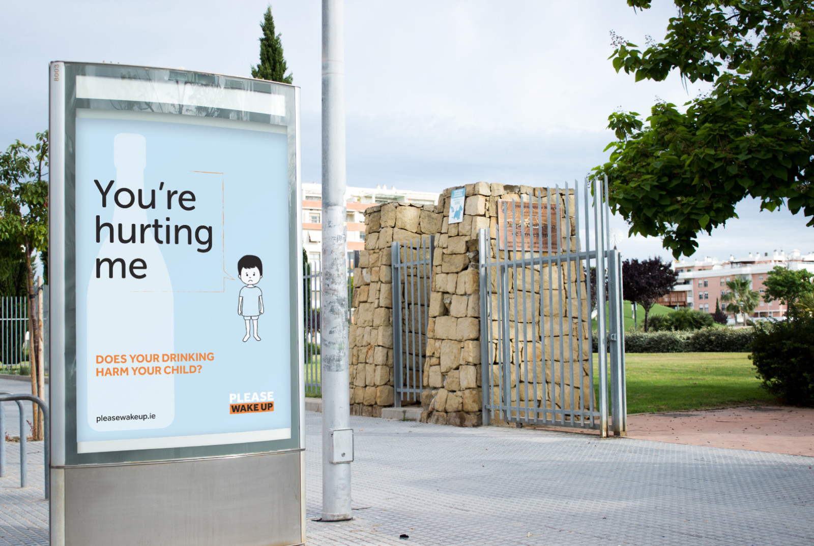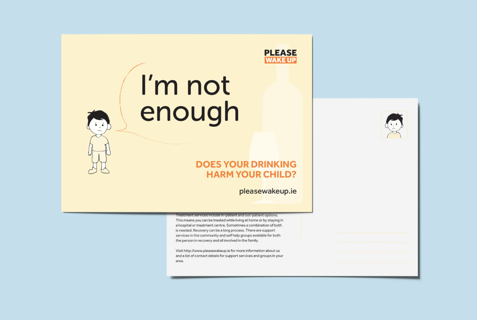
The impact of alcoholism on the whole family is considerable, and the dysfunction that occurs as a consequence affects not only the addict themselves but the wider family, and especially the children. Children suffer when a parent has an alcohol problem, and their lives can become chaotic or unpredictable. Indeed, for many children there is a serious and significant threat to their well-being. As such, it is the responsibility of parents to ensure that their children feel safe in their environment and do not witness alcohol abuse in the home. The primary objectives of this project are to inform parents about the adverse effects of alcohol abuse on their children, to educate them about their responsibilities towards their
children, and to enhance their children’s safety from abuse and neglect. In order to achieve these goals, a campaign has been created with the intention of exerting emotional pressure on parents and making them aware of the potential harm they may be doing to their children through their own daily alcohol abuse.